
Posted by Jon
A rare foray into a McDonald’s the other night. Yes, I know, but my son likes it – and I’m quite fond of their hot apple pies! Eating one of said pies, I was struck by the nutritional information on the packaging:
A rare foray into a McDonald’s the other night. Yes, I know, but my son likes it – and I’m quite fond of their hot apple pies! Eating one of said pies, I was struck by the nutritional information on the packaging:
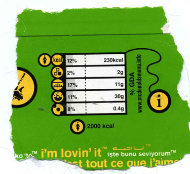
OK, there’s a prize for anyone who can tell me exactly what each of these symbols means, without looking at their website.
Graphics are supposed to simplify, to make things clearer, to be readily understandable. These do the opposite, obfuscating the information – as indeed do many proposal graphics, which merely serve to further complicate the already-confusing. (The old adage is “a picture tells a thousand words”, yet we often see overly-complex diagrams better described by “a picture full of a thousand words”).
On reflection, by the way, I thought that maybe the restaurant’s designers had originally come up with a much simpler colour-coding system, that would have been thrown out at the committee stage:
Red: eat lots of these and you will die very young
Amber: eat lots of these and you will die younger than you should
Green: eat lots of these and a long life will be yours, my friend.
 RSS Feed